Looking to refresh your style without a full wardrobe overhaul? Start with your eyewear. A striking new pair of frames can completely transform your look, giving even last season’s staples a fresh, on-trend edge.

Says Adele Camarena, business associate and eyewear stylist at Spectacle World Optometrists: “From pastel-hued acetates to bold geometric shapes and playful tints, this season’s eyewear is all about self-expression. Whether you’re into subtle sophistication or statement-making maximalism, there’s a frame for every mood and moment. Think of your glasses not just as a functional accessory but as the final, defining detail that pulls your entire look together.”
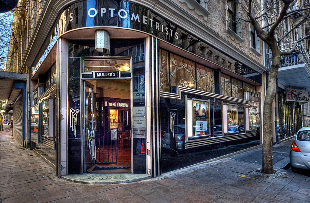
Brevan Robinson, Director at Mullers Optometrists, adds: “For men especially, eyewear is becoming a key part of personal style. The right frame can modernise relaxed tailoring, sharpen casual looks, or add an edge to retro-inspired outfits. This season is about finding balance – pairing bold, confident frames with versatile fashion trends so your glasses enhance rather than overpower your style.”
Frame your face, elevate your outfit, and step into Spring/Summer 2025 with a new lens on style.
Setting The Scene – how to match Spring/Summer 2025’s biggest fashion trends with bold, on-point glasses:
- Men’s tailoring takes a more relaxed turn. Suits remain on trend but are reimagined with looser fits, softer shoulders, and casual pairings e.g. jackets over shorts or layered with T-shirts. Pinstripes return with an easy-going twist, while breathable fabrics such as linen and soft cotton elevate relaxed silhouettes.
- Flowing shirts and loose trousers blur the lines between leisure and casual wear.
- Soft hues including lavender, mint, pistachio, and light blue are paired with grounding earth tones like khaki, sandy beige, and warm browns.
- Colour blocking embraces higher contrast and saturated tones (cobalt, orange, emerald), shifting from subtle accents to bold statements.
- Nautical and Riviera references bring a vintage vacation feel through white linen, sailor collars, lightweight knits, and breezy resort pieces.
- Florals are back, sometimes big and bold, sometimes understated. Offering more texture such as rattan, crochet, open knit, and tactile materials, prints such as checks or stripes are softened or reinterpreted.
- Durable textures and functional fashion also shine, with cargo pants, safari shirts, performance fabrics, and utility-style outerwear featuring prominent pocket details.
- Retro athletic touches nod to past decades with modernised jerseys, sneakers, mesh fabrics, and football-inspired silhouettes.
- Maximalist jewellery such as layered beads and chunky chains adds expressive energy. Pair standout eyewear with these looks, balancing statement frames above the neckline with bold accessories below.
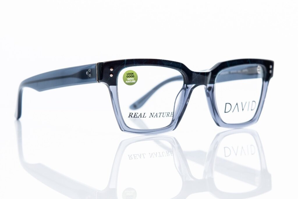
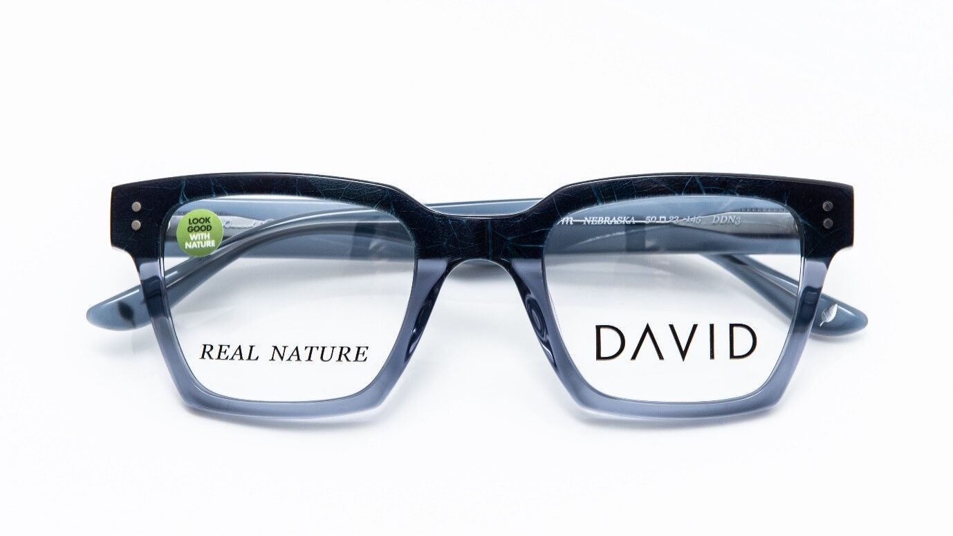
Spring/Summer Eyewear Trends Sustainability is no longer just a trend – it’s a lifestyle. From recycling at home to shopping pre-loved fashion, we’re all rethinking how we live. Naturally, eyewear is evolving too. Eco-conscious design now sits at the heart of many collections, with high-end brands embracing recycled plastics, bamboo, and biodegradable acetates to create stylish, sustainable frames.
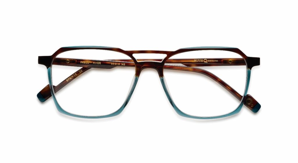
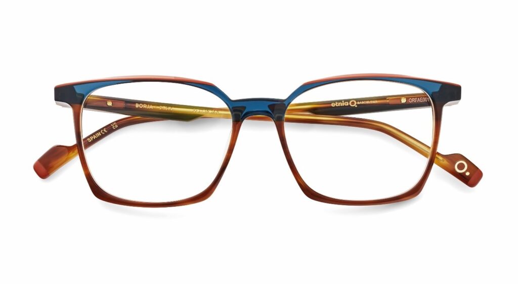
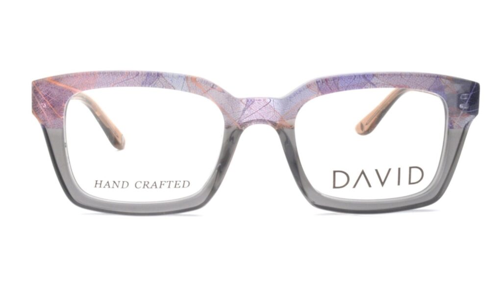
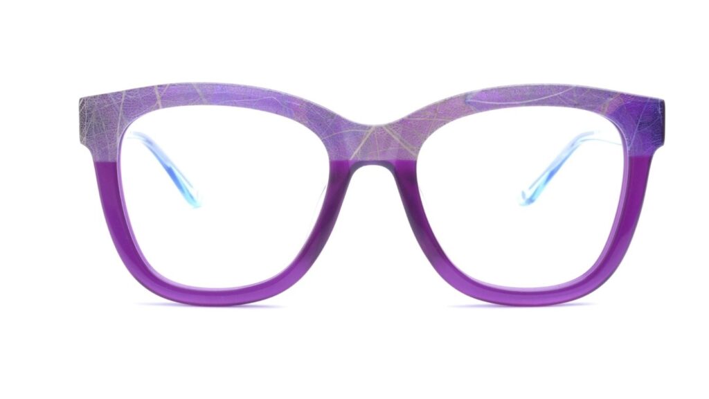
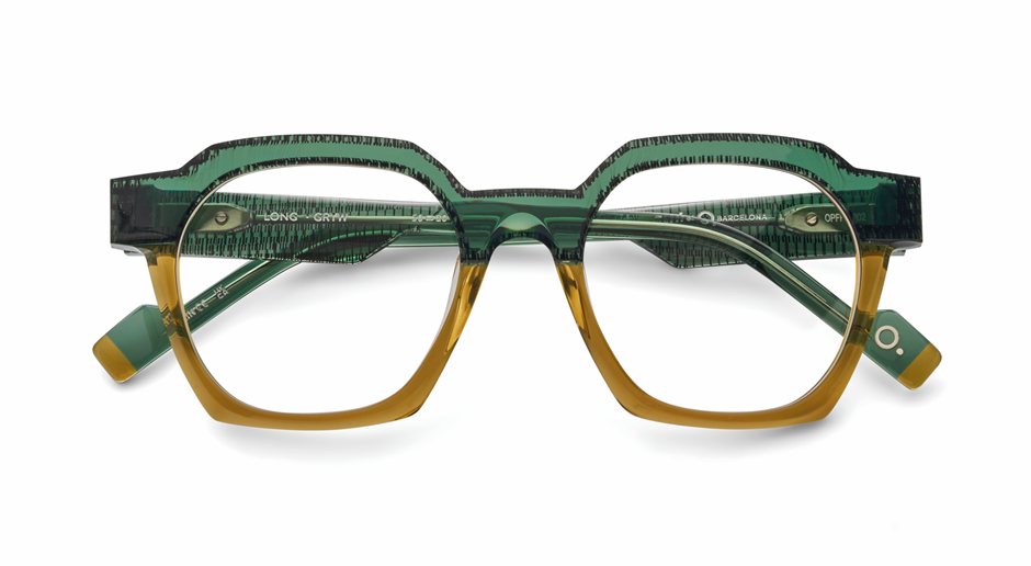
Aurora acetates remain a favourite, but the spotlight’s shifting to multi-coloured and pastel blends. These soft, gradient hues – often darker at the top – subtly frame the face and draw attention upward. It’s a flattering choice, especially for those with softer colouring, adding a hint of colour without overpowering your look.
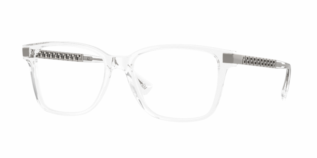
Bold maximalism isn’t going anywhere. Oversized ’70s-inspired frames make a powerful impact, with thick, vintage-style designs that nod to the ’60s, ’70s, and ’80s – just scaled up for dramatic impact. Bright, bold colours and unusual colour combinations are also dominating. This style is great for those with a large bone structure of feature but may overwhelm smaller faces.
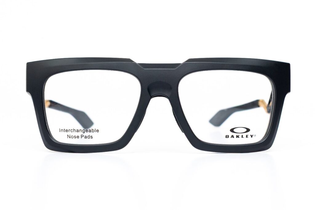
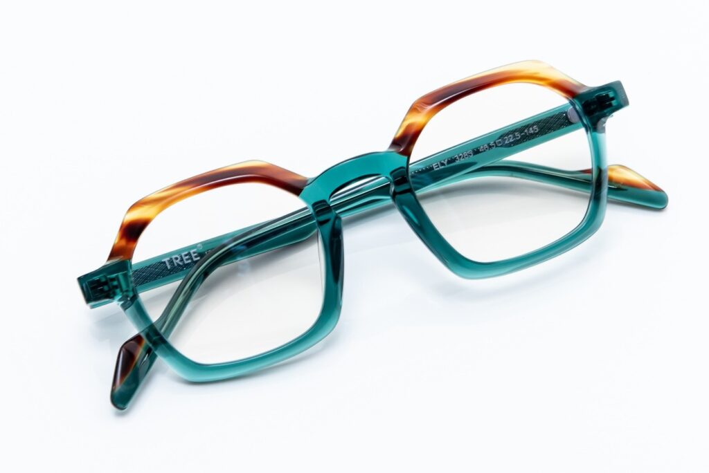
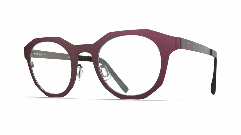
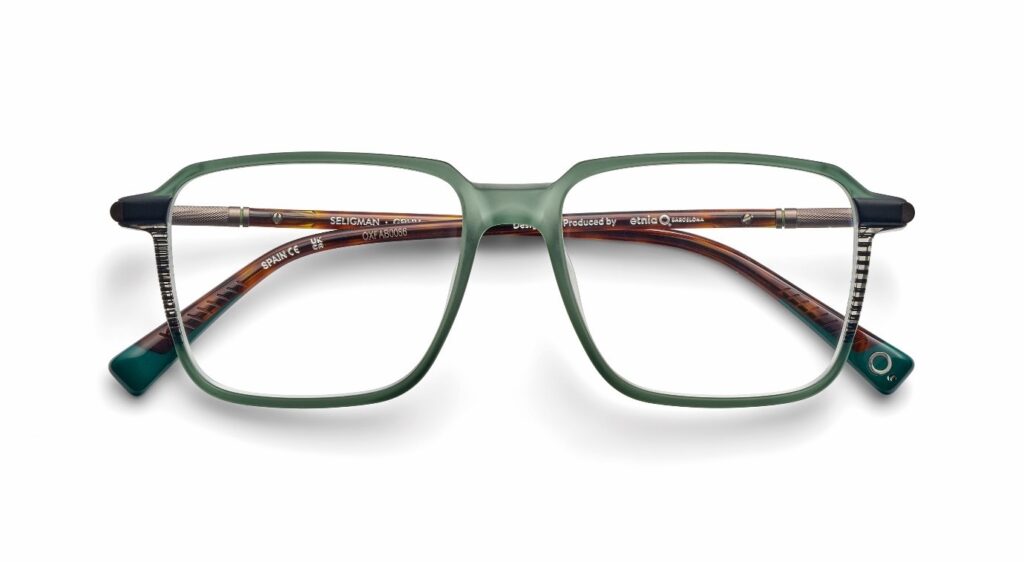
Geometric frames continue to be a go-to choice for those seeking individuality. This season leans into softened angles – think hexagons with rounded edges or angular ovals – that add just the right amount of structure and intrigue to any face shape.
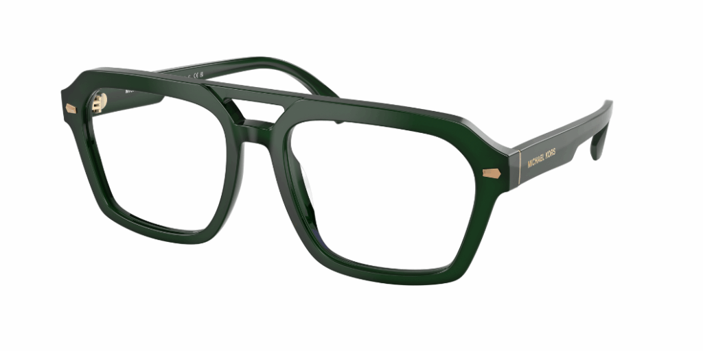
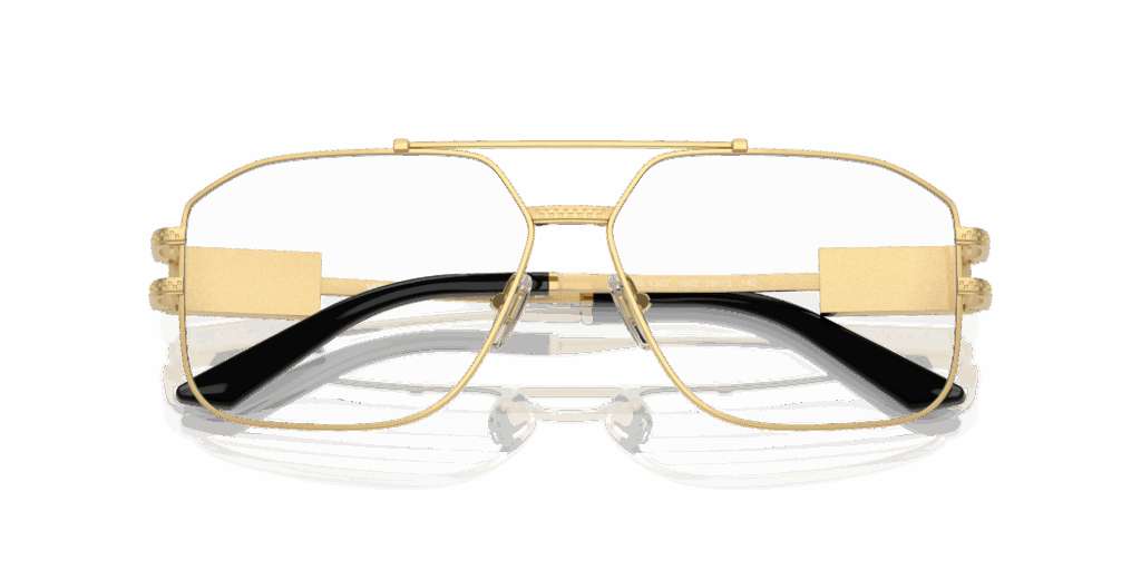
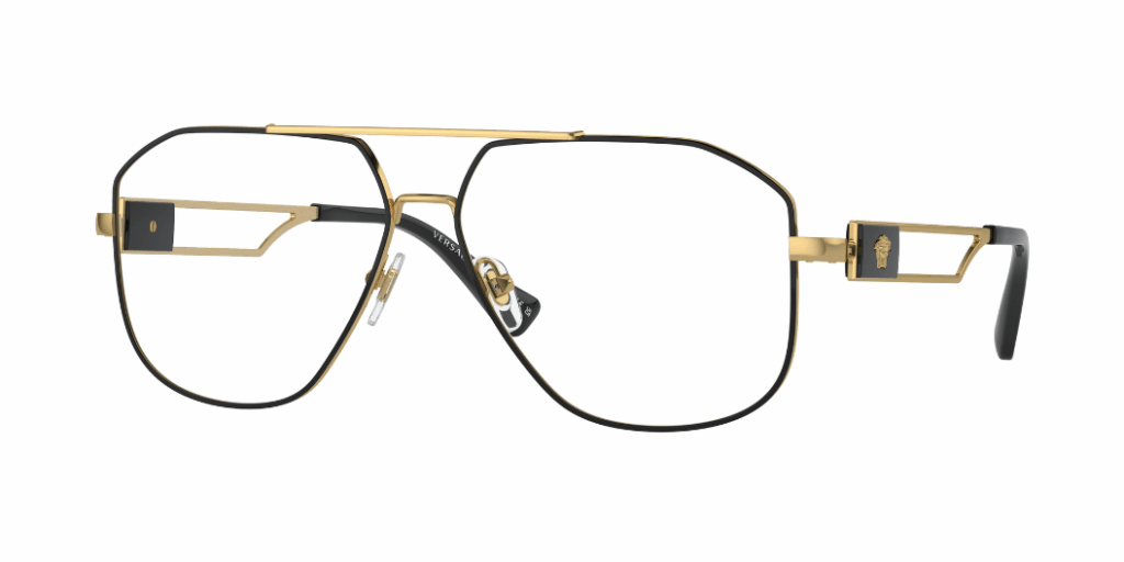
Flat-top frames and aviators also hold their ground, blending retro flair with modern boldness. These styles accentuate the brow line and bring a sharp, architectural edge – ideal for adding a touch of masculine energy to any look.
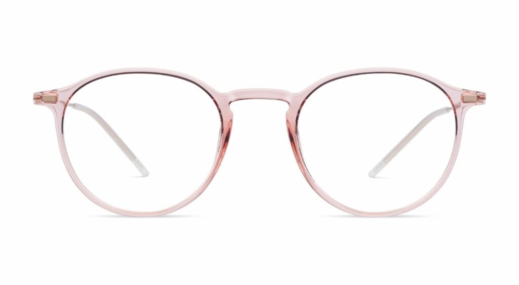
Pastel acetates make a soft, stylish entrance this spring, with delicate shades like blush, lilac, and mint offering a fresh update – especially flattering on lighter hair tones. For those with darker hair, richer candy-toned pastels provide the perfect contrast, adding depth without overwhelming.
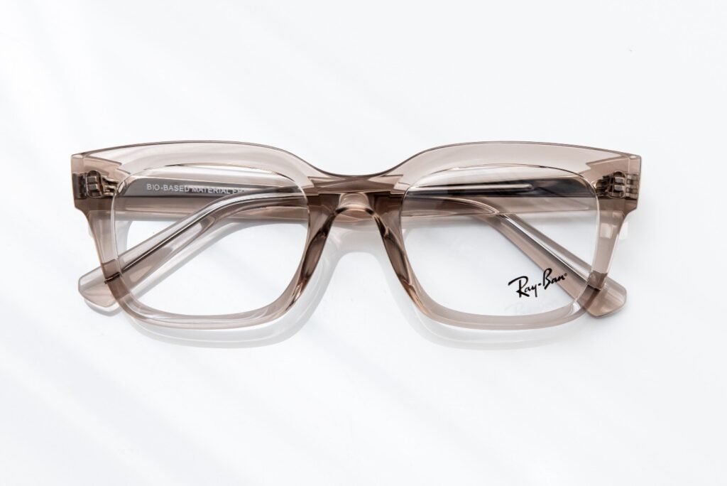
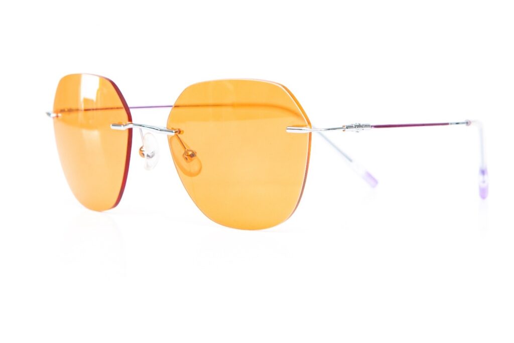
Minimalist frames are still in the spotlight, featuring thin metals and subtle ’90s vintage-inspired details. Rimless glasses are quietly making a comeback, embraced by today’s trendiest celebrities. These styles offer a delicate, understated contrast to bolder eyewear trends, perfect for those with petite features who appreciate elegant simplicity.
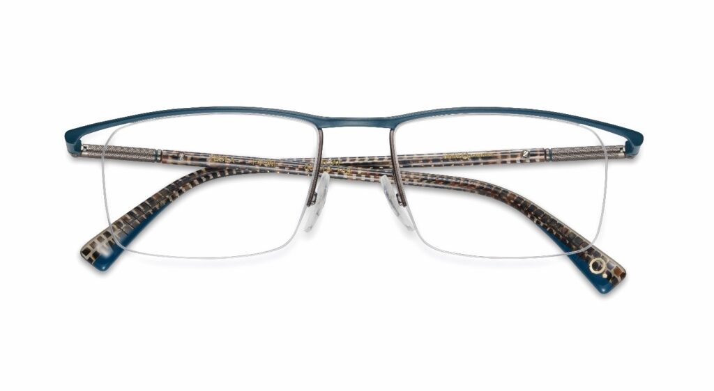
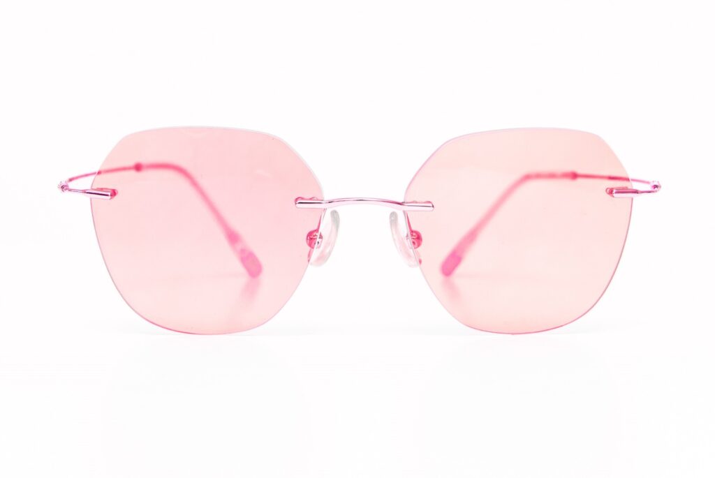
Retro tints remain a staple, but in 2025, they get a bold refresh. This season is all about vibrant lens colours – think rose pinks and candy blues – that inject playful energy into classic metal and rimless frames. These softly saturated shades turn minimalist silhouettes into standout pieces, striking the perfect balance between vintage charm and modern flair. Whether styled with sharp tailoring or laid-back casuals, tinted lenses are a go-to for adding personality, colour, and individuality to your look.
Pantone’s Spring/Summer Colour Trends:
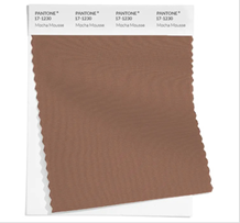
Mocha Mousse: Pantone’s Colour of the Year: This soft, warm cocoa brown is a perfect neutral for those with light and delicate colouring. For those with dark hair and stronger colouring, Mocha Mousse works beautifully as an accent colour paired with a dramatic tone like cassis to create a show-stopping statement.

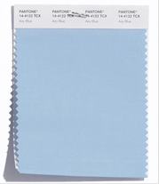
Airy Blue: A fresh, light sky blue, ideal for those with light soft and cool colouring, especially in combination with blue eyes. Those with dark hair and stronger colouring will need to wear it with a contrasting shade like dark navy, while warmer complexions are better with by yellow-toned blues, such as aqua.
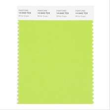
White grape: A light summer yellow-green inspired by freshly ripened grapes. This shade flatters lights and warms. Clears and deeps can pair it with purple for contrast, whiles softs benefit from muted tones like verbena. Cools are best complemented by blue greens.
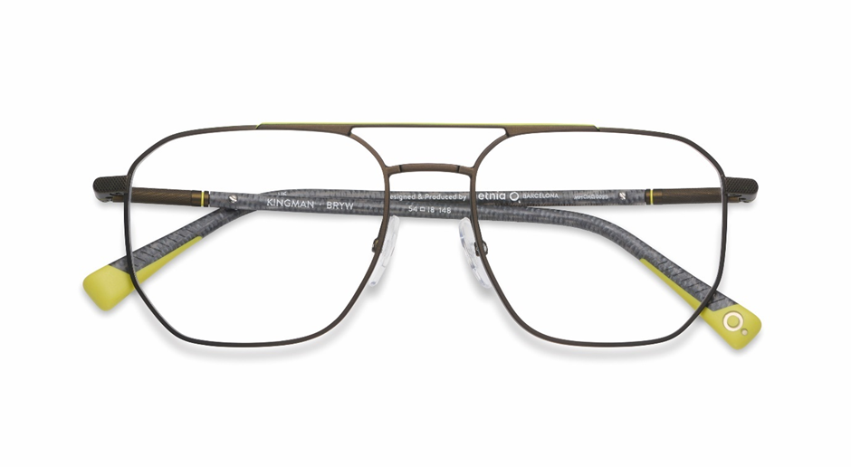
Pear Sorbet: A pale creamy yellow inspired by a ripe pear. This beautiful, tone is ideal for those with light or softer colouring, clears and deeps should combine with a darker shade, and warms with a warm shade like chocolate brown.
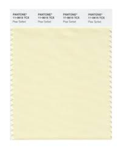
Viridian Green: A deep, cool green inspired by ocean depths. This sophisticated shade suits cool undertones, while warmer complexions are better complemented by yellow-toned greens like olive.
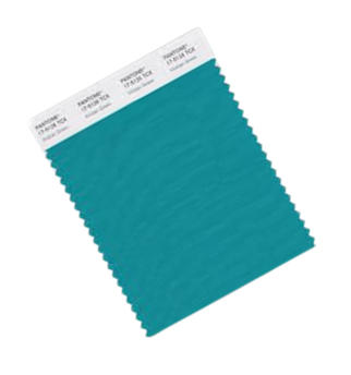
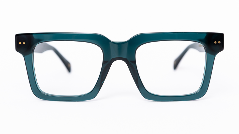
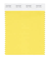
Yellow Jasper: A golden yellow inspired by the jasper stone, perfect for warm colouring. For cool undertones, it works best as an accent colour or within patterns.
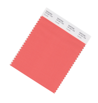
Camellia: A vibrant, energetic coral inspired by the camellia flower. This shade is ideal for warms, while cooler complexions can use it as an accent or opt for a blue-based pink like blush instead.
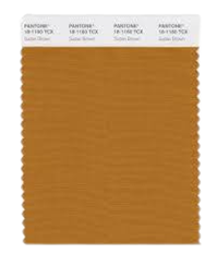
Sudan Brown: A warm, earthy brown reminiscent of desert landscapes. This shade is excellent for warm undertones, while cooler complexions are better suited to grey browns like taupe.
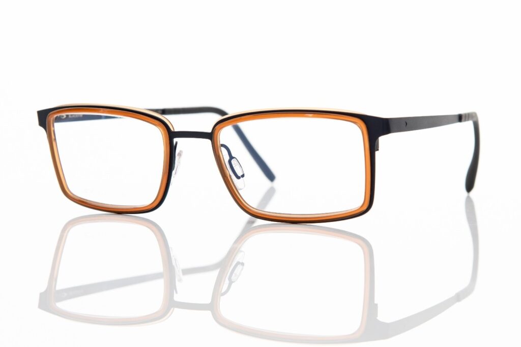
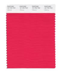
Hibiscus: A bold, vibrant red-pink inspired by hibiscus petals. This cool red is ideal for cools and clears. Warms are better suited to orange-reds, while softs and lights should opt for gentler reds like geranium.
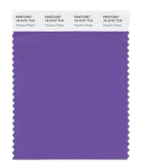
Passionflower: A rich, purple inspired by the passionflower. This is a universal shade that flatters all colour types.
Windsor Wine: A deep, luxurious burgundy with a purple undertone, exuding elegance and depth. It’s a stunning colour for deeps and cools. Warms should look for burgundy with a red or orange undertone.

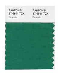
Emerald Green: A rich, vibrant green inspired by the gemstone. This shade is ideal for clears and deeps. Cools are better suited to blue greens, while warms shine in warmer greens like lime. Softs and lights are flattered by softer turquoise shades.
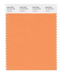
Tangerine: A vibrant, warm orange inspired by citrus fruit. A bold colour for warms, it can also work as an accent for cools or in patterns. However, vibrant pink would be a more flattering alternative for cooler tones.
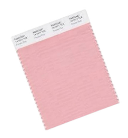
Powder Pink: A soft, delicate pink with an airy and calming quality. This shade is perfect for lights and cools, pairing beautifully with silver, lilac, and grey. Warms should consider yellow-based pinks like salmon or coral, while deeps and clears can pair it with contrasting tones like dark grey or chocolate brown.